Conventions of Great Poster Design (Part 1) : Get Inspired

 Poster design is a medium often under-explored in the online design community, arguably because it is regarded as a largely print-based art. Poster design can be as rich and varied as any other art-form, as this will article will show by exploring the huge variety in style and form.
Like any art form poster design often adheres to certain conventions. This is not always the case of course, but more often than not successful poster design can be seen to fall into one or more of the categories discussed below.
- Primary Visual of Poster is Centered
- A Unique/Eye-Catching Design
- Large, Bold & Interesting Typography
- Colorful and engaging
Primary Visual of Poster is Centered
More often than not the viewer’s eye is drawn to the center of a great poster. The main visual element of the poster is typically displayed in the center of the design, and rarely near the edges. This is partially to conform with the way that the human eye works (typically humans will look towards the center of a display, rather than to the edge or corner). However, it also creates a ‘frame’ around the central object or design. The edges of the poster frame this centerpiece, and in doing so give it more impact and prominence.
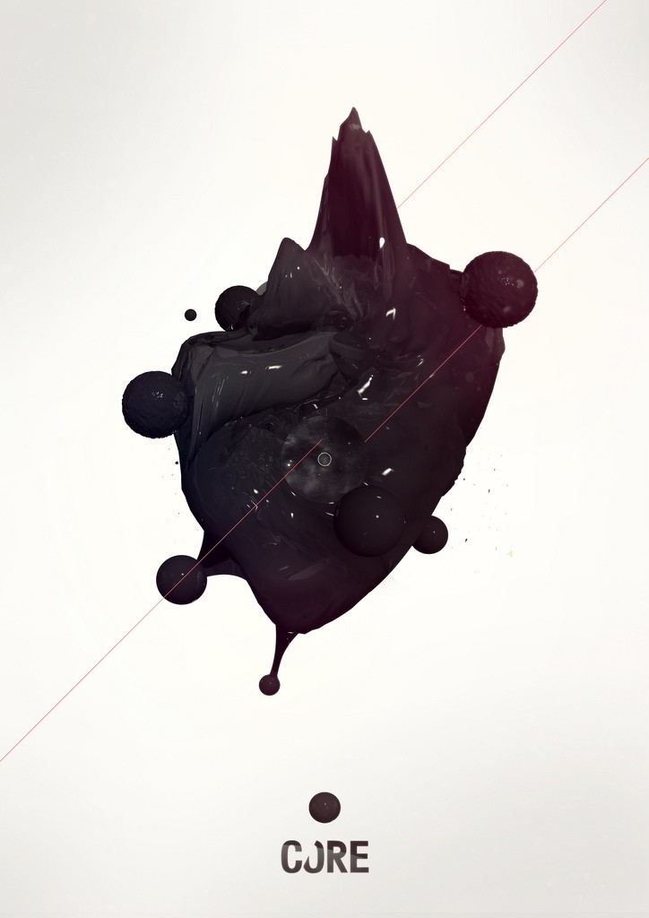
1. CORE Black Renders 2
The abstract 3d visual in this poster is given total precedence not only through its contrast with the light background, but its central placement. The eye is immediately drawn to the center of this design, which is framed nicely by the surrounding white space.
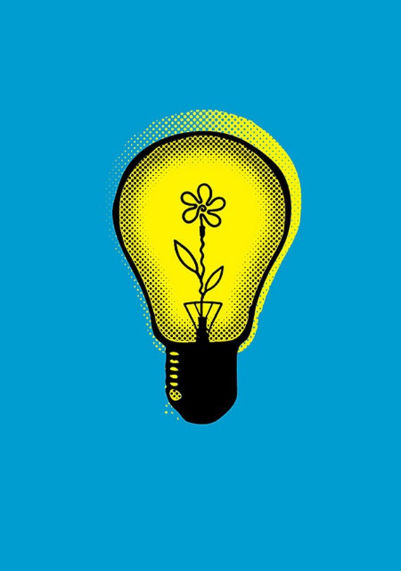
2. Flower Bulb
The fun, colorful illustration in this poster is nicely framed by the plain background color surrounding it. The poster would not be nearly as effective if the illustration was pushed against the side of the poster, and being centered feels symmetrical and visually appealing.
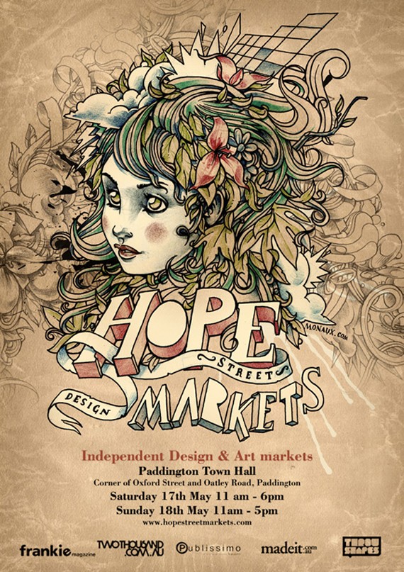
3. Hope Street Markets
This poster is not quite as clearly recognized as a central design. The busier nature of this poster means that the central image doesn’t feel quite as framed by the surrounding background. However, if you look closely the background design and subtle details actually help frame the main image as a central feature. Many parts of the illustration actually point inwards, drawing the viewer’s eye inwards from the edges of the design, towards the center.
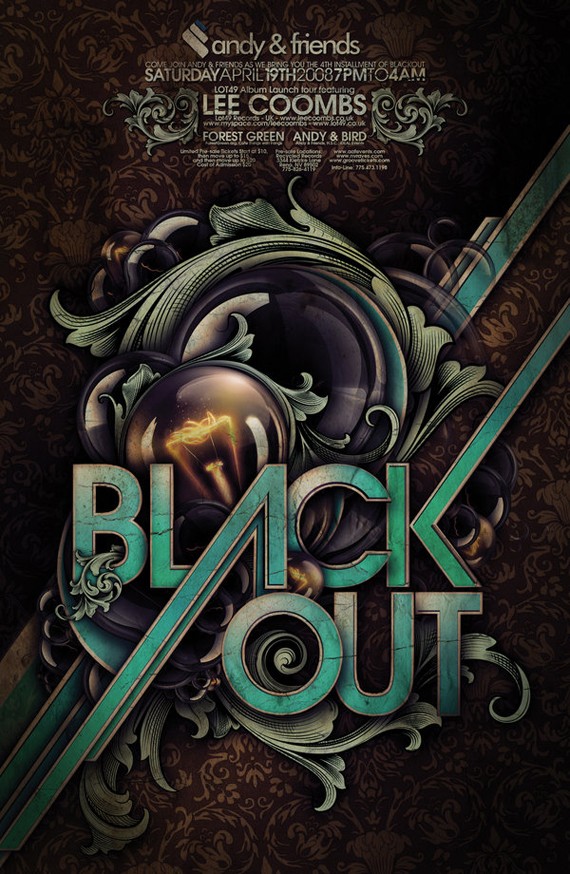
4. BLACKOUT POSTER
This is another example of a busy poster that maintains a central focus. Despite the edges and background of this poster containing a lot of detail, they all draw the viewer’s eye inwards towards the center. The linear lines of the typography cause the viewer to follow them inwards towards the primary text.
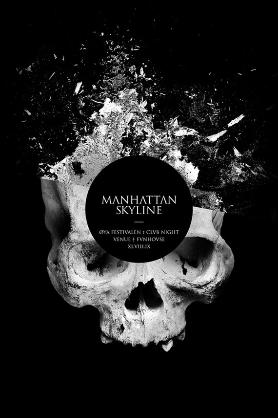
5. Manhattan Skyline / Oya Festival Clvb Night
This is a really effective design. The bright center image really stands out against the black background, which frames it very well. The shattered effect actually brings the user’s eye inwards rather than outwards, in a kind of cause/effect model (we see the shatter, and look inwards to see the cause of it).
A Unique/Eye-Catching Design
Like most types of design, often a great style is not enough to really make an impression on your viewers. You must showcase a truly unique image or idea.
Poster design is a perfect medium to demonstrate this theory. The best poster designs are highly impactful, and a big part of this is through being different or interesting.
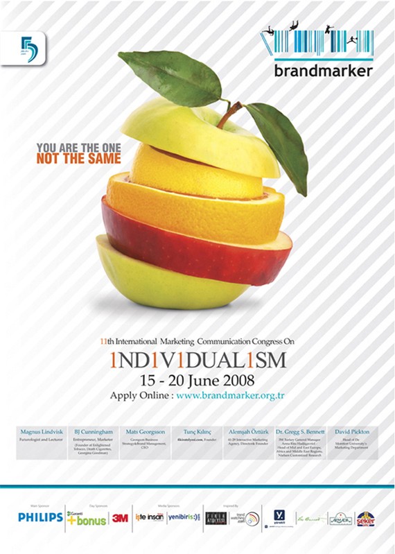
6. INDIVIDUALISM
This poster takes an ordinary image (fruit) and makes it something really interesting and unique. The layered effect is a simple concept, yet really grabs the viewer’s attention. This proves a simple analogy of seeing a poster in the street. People will walk past an ordinary design, but it takes a truly eye-catching design to make people stop and take notice.
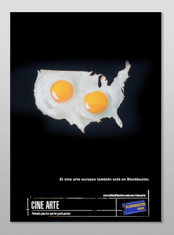
7. Cine Arte Poster
This poster again takes something very ordinary (a fried egg) and photo-manipulates it into the shape of the USA. This is a really different image, and therefore catches the viewer’s attention.
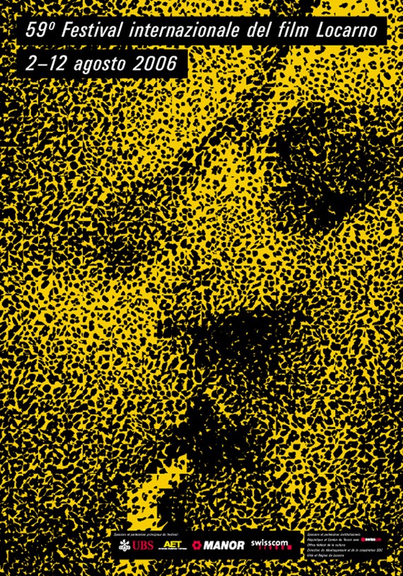
8. 59 Degrees Festival del Film Locarno
The designer of this poster has taken a fairly ordinary conventional image (a kiss) and made it something special. The awesome abstract vector effect used makes this image really stand out.
Large, Bold & Interesting Typography
Typography is a key element of many posters, and like most poster designs boldness is essential. Poster typography is typically large, bold and perhaps most importantly interesting. The examples below show the range of typographical approaches taken by some very talented designers.
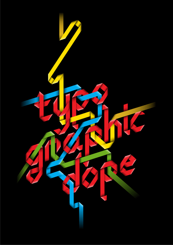
9. Typo-grahic Dope
I love the approach that this designer has taken. The typography in this design is highly unusual and is extremely bold and colorful. It may not be the most readable type, but the weaving effect grabs your attention.
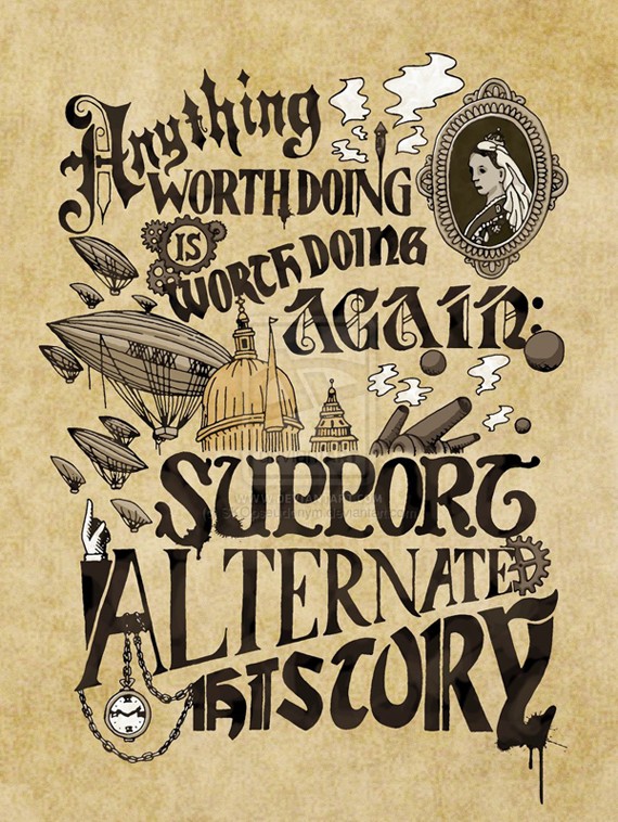
10. Anything Worth Doing
I love the hand-drawn technique used on this poster. Rather than using overdone digital fonts, the hand-drawn approach allows this typography to be totally unique.
11. Typographic Posters
The typography in this poster is incredibly bold and impactful. The rest of the poster is fairly minimal, meaning that the text stands out a lot.
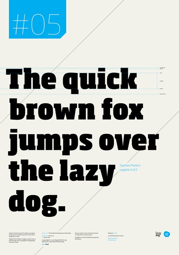
12. Typographic Posters
I love the huge typography used in this poster. The very large type allows the viewer to make out every detail of the letter, and appreciate the typographic elegance.
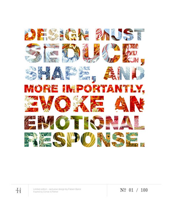
13. Limited Edition Posters
This poster demonstrates that typography does not always need to be legible, but should be interesting. The viewer makes the extra effort to read this poster, just because the colorful, detailed text is so unique and visually stunning.
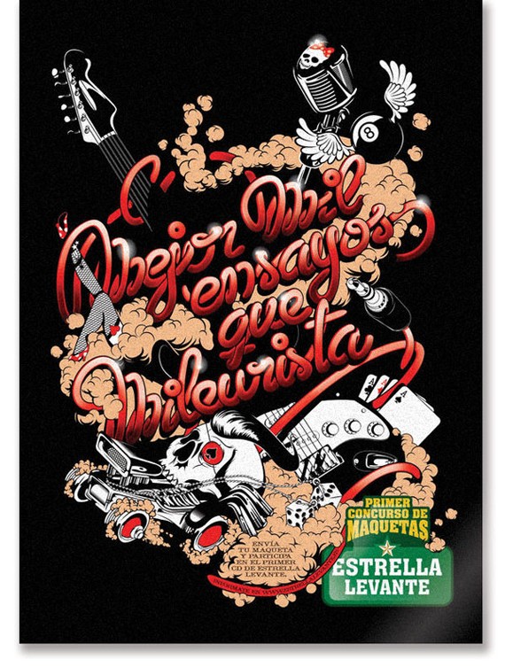
14. Estrella Levante Poster
This hand-drawn typography is seriously eye-catching. The text artfully entwine around the heavy metal design, and the overlaid noise effect is really gritty.
Colorful and engaging
Great poster designs are often very colorful and engaging. The brighter, bolder colors help catch people’s eye, and make them far more noticeable. Of course there are posters that use more subtle colors, but the examples below show some great use of color, and help demonstrate how this can be used beneficially.
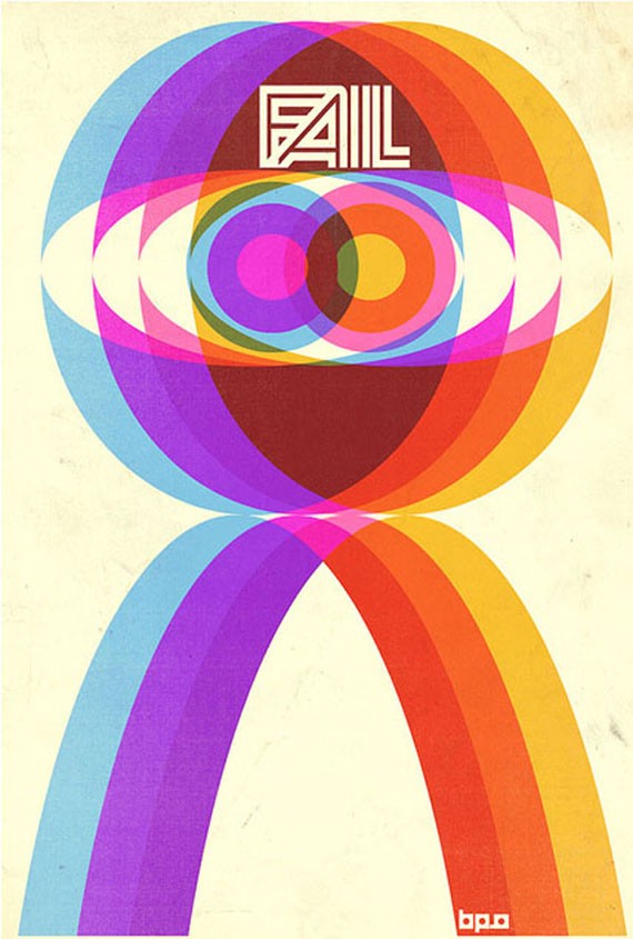
15. FAIL Booklet
The rainbow type approach taken in this design really pops. The variety of colors forms a kind of vector styled gradient, and the integrated eye design is like a staggered optical illusion.
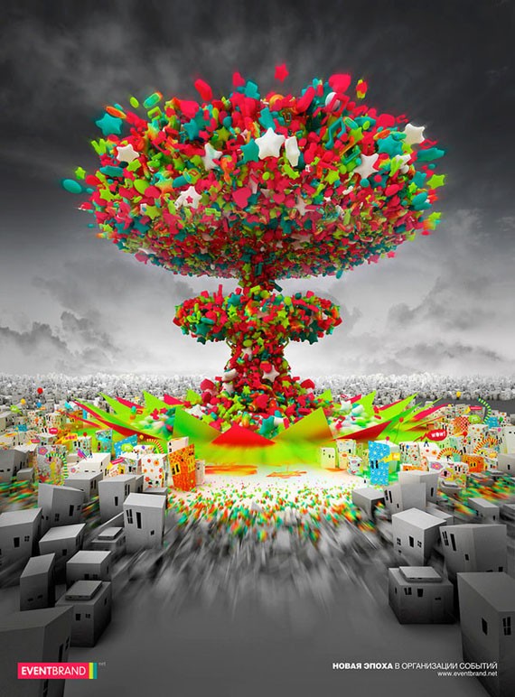
16. EVENTBRAND.net Poster
The color in this piece is especially effective as it contrasts the grayscale setting. The abstract nuclear blast of color is full of energy and life, and can’t help but fail to impact the viewer.
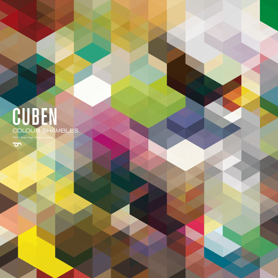
17. CUBEN 2010
The colors in this poster aren’t the brightest, but the sheer variety of color makes this poster engaging. The overlapping opacities mean that colors combine to create new hues, and the result is a myriad of tones. The angular design means that shapes combine to form a range of 3d constructions.
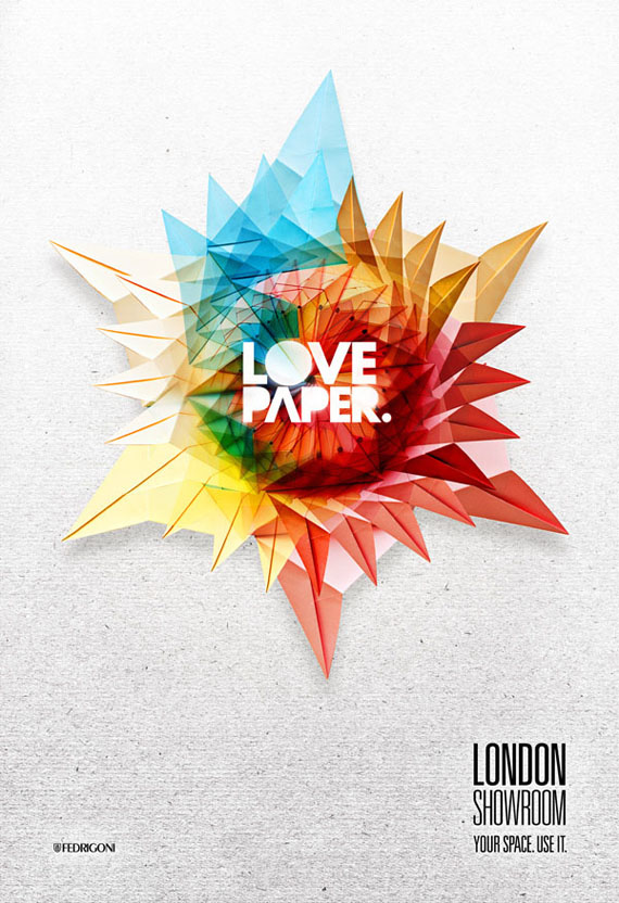
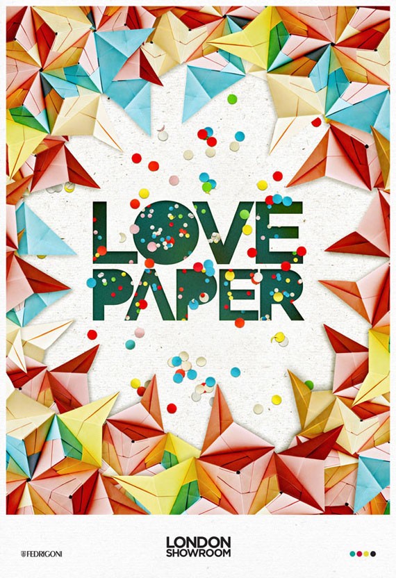
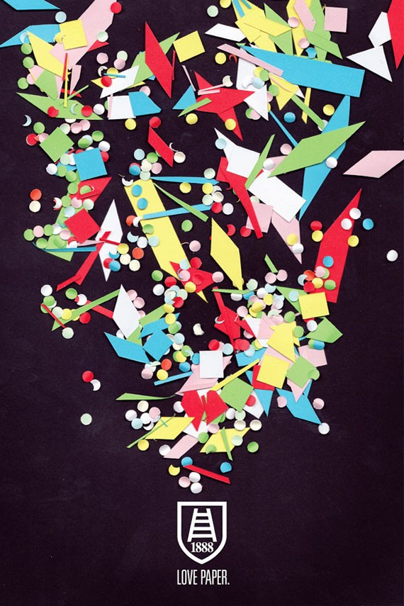
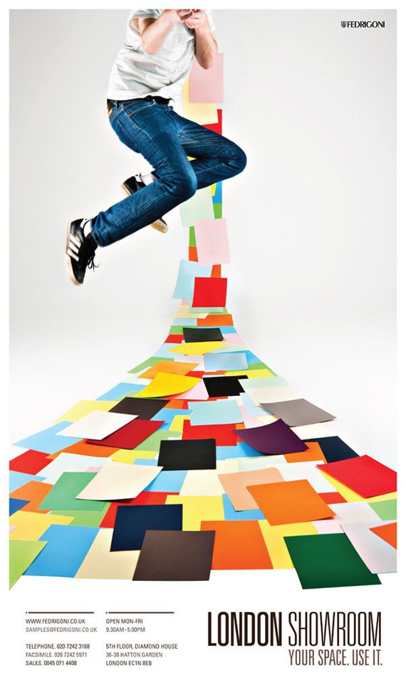
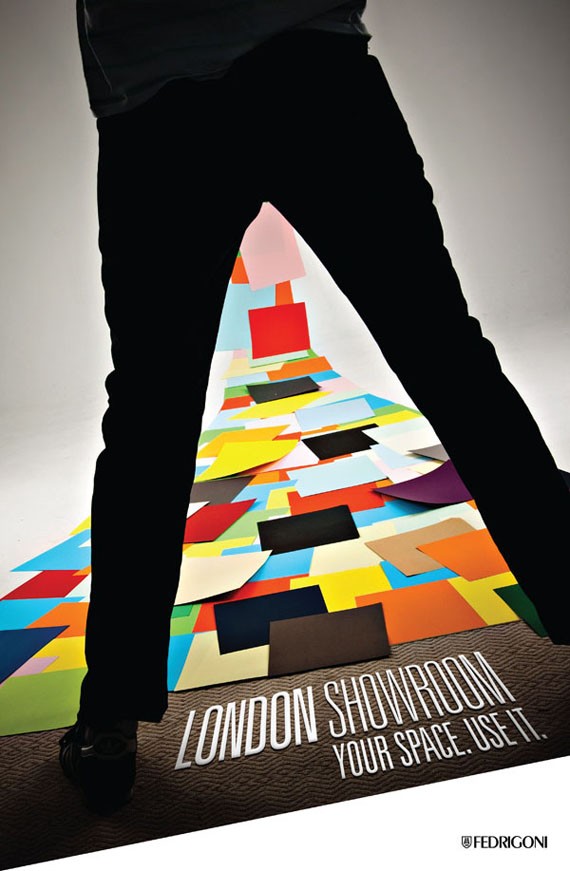
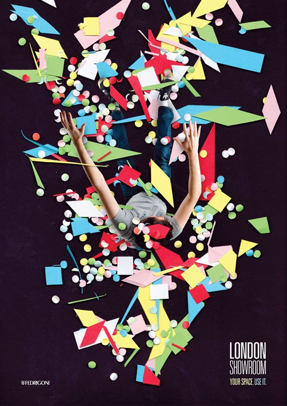
18. Fedrigoni
This exhibition was designed to bring the paper and design industries closer together. The beautiful designs are largely constructed using a range of colored paper, and are all extremely bold and engaging. The origami style designs help showcase the palpable, physical nature of paper vs digital design.

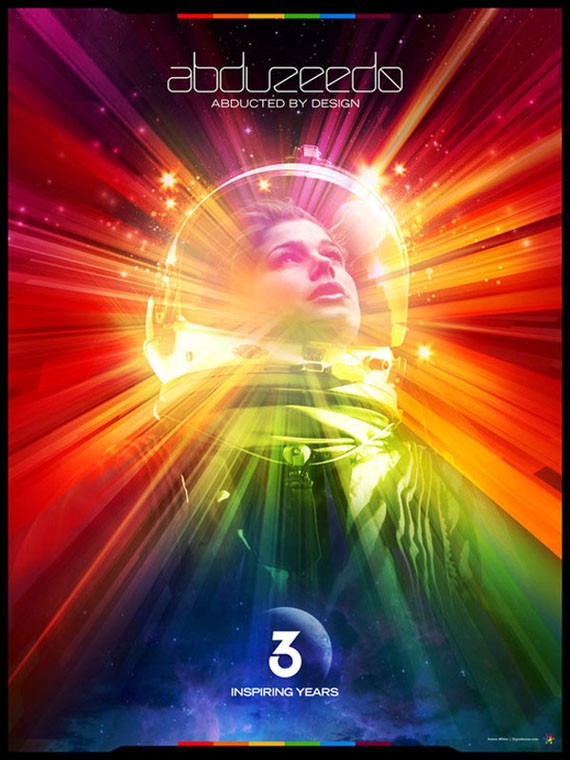
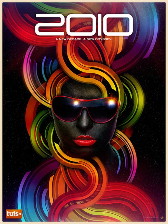
19. James White: Commemorative Posters
James White is arguably one of the modern masters of color. His digital poster designs have become world-renowned, and this is largely due to his expert use of color. The examples below show how he often opts for brightness and boldness in order to capture viewer’s attention. The posters below combine a wide variety of colors, yet each are blended beautifully, and complement one another.
- Login om te reageren