The Secret Of Successful Minimal Font Usage

Minimal fonts can awesomely enhance any artwork if used properly. You can see more and more websites using minimal fonts in their designs. Personally I love the neat look of bold minimal font in a minimal design. In this article you’re going to find some tips together with stunning examples to learn more about minimal font usage in web design. While minimalism seems easy – it really isn’t, it takes great skill to come up with something clean, professional and unique at the same time! Let’s jump into art of minimal fonts?
Bigger Is Better
Since minimal fonts are rather slight you’ll have to use bigger font sizes in order to make your text visible and easy to read. Try to avoid using a font size lower than 14 points. Big and bold minimal serif fonts usually look awesome in headers and plain backgrounds. Large minimal headlines add an interactive look and accent to minimal designs.

Fajne Chlopaki uses huge headlines in his website’s header. The site has a clean and minimal style and these large fonts add a creative look to, and complete, the design.
Contrast
If you’re using minimal fonts be sure not to lose contrast. Try to implement light fonts on a dark background or vice versa. Stronger contrast will make your text easier to read since minimal fonts tend to blend into the background if the contrast is to low. Strong contrast will also enhance the whole look and make the fonts really stand out.

The Visualbox site has a dark background and they’re using white fonts for titles. They’re also using a large font size so the text is very noticeable. These minimal style titles also add a little accent to the design.
Keep It Minimal
Minimal fonts are for minimal usage. They’re neat when used sparingly and in the right situation, though they can look unrefined and clash if you clutter them and use inappropriately. Minimal fonts won’t look good in visually heavy designs. Less is more – they will look great in minimal designs with a lot of white space and few details.

Oliver James Cosling’s portfolio has a clean and minimal look. He’s using a large minimal font for the title and a smaller one for navigation. These fonts look strong and neat and they complement the design excellently.
Limit Your Fonts
Different type of fonts tend to conflict with each other and create a mess within your design. It’s especially true when talking about minimal fonts. Accurate use of fonts can add the right flair and character to your design. Using a select few however will help maintain a consistent look. Two to three fonts is usually good, of course, you can use more however you’ll have to be careful that they don’t cause visual noise.
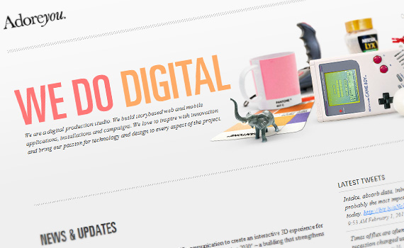
Adoreyou is an excellent example of effective use of minimal fonts. The site itself is a consistent, well-designed minimal style website. They’re using one minimal font for navigation and another one for the titles. The fonts are perfectly implemented into the design, they’re suitable and engaging at the same time.
Examples
Below you’ll find some stunning examples of minimal font use in web design. Each example is unique so you can see how a wide range of minimal fonts can be used. Check out these examples to learn how to implement minimal fonts effectively.


3. Josh Sender


5. Studio Luma

5. Teixido


7. Samweb

8. Giles Revell

9. Doublenaut

10. Efingo

Fonts
I’ve also collected some nifty, good-looking fonts for you to start enhancing your designs.
1. District Thin

2. Tex Gyre Adventor

3. Cicle

4. Sertig

Minimal Fonts in Web Design: Tips and Inspiration
5. Yanone Kaffeesatz

6. Hattori Hanzo

7. Extravaganzza

8. Tuffy

9. Print Clearly

10. Titillium

Conclusion
I hope you learned something new from these tips and found the examples useful. Remember that minimal fonts are mainly for minimal usage. Don’t exaggerate, though feel free to experiment and achieve new looks. Minimal fonts are subtle but they have a personality which can bring your designs to a whole new level.
- Login om te reageren