Capture Visitors’ Attention Through Your Home Page

What made me decide to share with you this article is the experience I had when I was working as a part-time freelancer. I remember that whenever I planned the design for websites, I always made it a point that the home page is the most attractive page on the site. I made sure that the home page can capture each viewer that visits the site, not only to scan the home page but to enjoy exploring the whole site.
The home page is the page that loads when the Home button is clicked and usually the first page you see when a website loads. Therefore, it is one of the most important pages on your site. Do you agree?
Look at the image below. If a person wants to be loved, the first thing he or she will do is to be attractive to get the attention of the opposite sex. Then, they will find a way to search and know that person well. We know that the first thing a person looks for is the physical appearance, that’s why we are doing almost everything just to look attractive. Haven’t you thought that this can also be applied to web design? If a website wants to get the viewers’ attention, then the physical appearance must also be attractive.
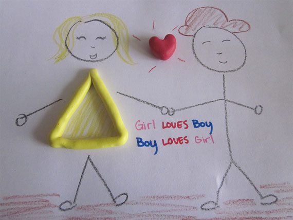
Image by: Camille Joyce Pascual
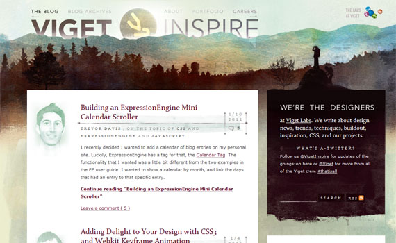
A home page is also like a teaser…
A teaser is one way to advertise, and a homepage advertises too (even a website). A teaser “teases” viewers that drives them to be curious. A homepage should have this characteristic too. Viewers must be curious the first time they see the homepage and make them explore the whole website.

Image by: trolf
In this article, I will be sharing some of my ideas on how can you let your viewers love your site and tease their eyes by making your home page capture viewers’ attention. But let us know first on what should be the characteristics a home page must have.
Must-Have Characteristics of a Homepage
1. Attractive
Every pages of a site must attract viewers. This way, they won’t get bored while visiting each page of your site. But the home page must be more attractive than the other pages of the site because this is the first page your viewers will see. In creating your homepage, you may ask the question, “How can I make the home page attractive?” The answer to this question is good designing.
Appropriate and Attractive Color Scheme
Colors capture viewers’ attention, especially if they are used in an appropriate manner. If your expected viewers are children, the best colors you can use are the bright ones but make it pleasing to the eyes. If you are designing for a company, then you should choose colors that can give a professional look.

Image by: Elissa Merola
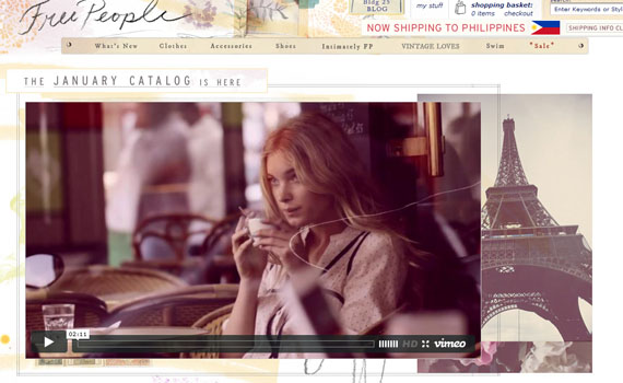
rapid xhtml is one of the websites with very attractive color scheme and still remains to be appropriate for the website. The dominating color, which is White plus the nice shade of Blue they used blended well on the other elements of the site such ash the header, the orange mascot and navigations of the site. It’s very appropriate, clean and professional in look.

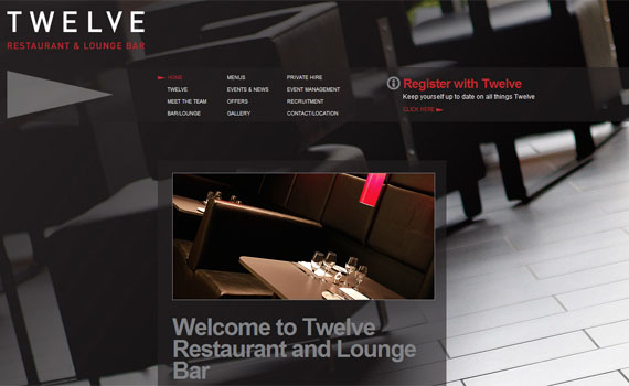
Creatively Designed Header
Headers also attract people. With modern designing, headers are now becoming very dynamic and really creative. Take a look at the example below. There are different kinds of tools gathered together and on the monitor part, there’s a video clip playing. This is a good concept of telling the audience that the website is related to media such as photography, video, audio, etc.
![]()
Easy-to-Understand Navigation
To capture lots of viewers, you need to have a well-designed navigation. Viewers want everything to be spoon fed on your site, so when they see your navigation they should already understand how it works and so.
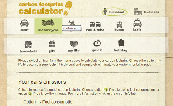
Carbonica is one good example that has a well-designed navigation. The designer made a nice concept where the buttons are labeled so that people know on what to expect when they clicked a certain button. Like when clicking the motorcycle button, the page that loads is a calculation of a motorcycle’s emission.
2. Focused
Home page must focus on its purpose. For instance, if the website advertises a company’s services then the viewers must instantly know what the website’s purpose is. And that is to advertise the company and its services.
Viewers do not want to waste their time thinking on what could be the site is all about. Instantly, they want to get the information as soon as the page loads. Like when you are searching for a specific book in a library. If you are looking for a PHP for Dummies book, you don’t want to waste your time going around each section, rather you will just go to the Computer section of books to find what you are looking for. That’s what viewers expect on each site, and you can already give them an idea on what your website is with your home page.
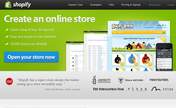
Shopify did a great job on putting focus on what they do. From the domain name up to the home page, you can already grasp what services the website advertise.
3. User-friendly.
One thing that viewers expect on a website is how friendly it can be used. It should provide a comfort and fulfilling time when they explore the site. Many people will say that a home page is just a single page, so it is not important if it is easy to use. I tell you, if the viewer finds it hard to explore the home page then they will just press Alt + F4 or Ctrl + T.
What are the criteria of a user-friendly home page?
Speed
Your home page and other pages must be fast in loading. Or else, your viewers will get disappointed on your site.
Content
There are two things to focus on the content: language and grammar.
In terms of language, English is the widely used all over the world. It is very annoying for viewers when they cannot understand the language you use. If I were to ask, I prefer English to be the language to be used on a website.
There are some people who tend to get annoyed of wrong grammar and leave. So before posting, be sure that the grammar is correct.
Buttons
It should be easy to use and understood by your viewers. Especially in the home page, for this is the starting place of your viewers. So if your buttons are not user-friendly, then they might just leave your page and search for a related one.
Custom Toronto is one of the best examples of site that I find very convenient when exploring. The content is well-written and some information teases you to know more of it, while its buttons are not complicated to use.

4. Drives curiosity.
Awhile ago, I have mentioned that the homepage is like a teaser that drives curiosity on your user. I will give you another analogy. The flyers people distribute inside shopping malls offer 70% off on all or certain items. The offer might suit your needs either be it a boutique or a restaurant. If it suits you, you might go. That’s how a home page must work, it should drive the curiosity of your viewers to visit your site and let them get back next time.
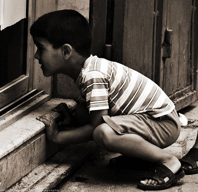
Image by: Maya Alameddine
Some Tips to Ponder
I have here some tips that can help you create a captivating home page. To give you comfort in reading, I have categorized each tips based on the elements to be found on a home page.
1. Do not be a spoiler
Home pages are intended to tease viewers, and will have the move to explore. Do not spoil them by putting all information they need on the homepage.
2. Attract
Attract to get their attention by:
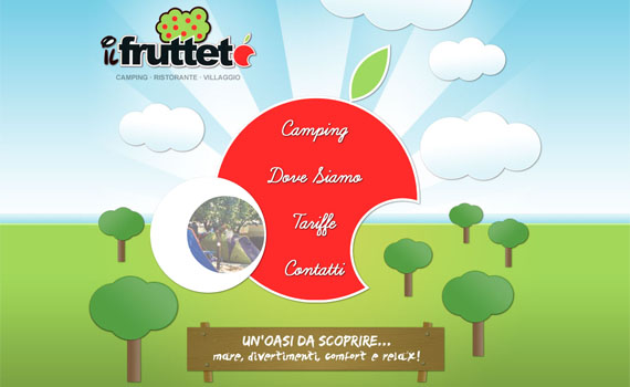
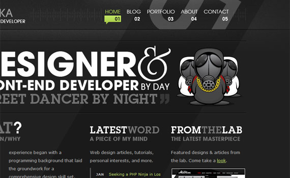
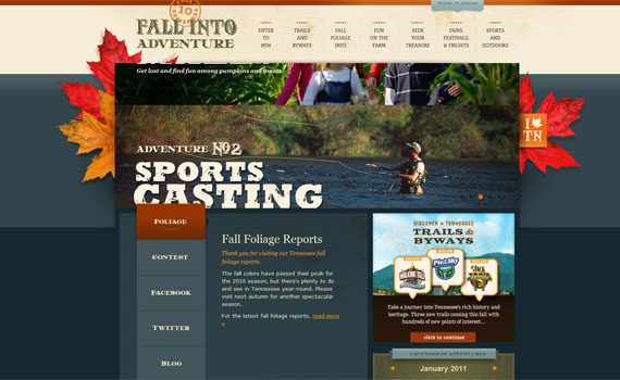
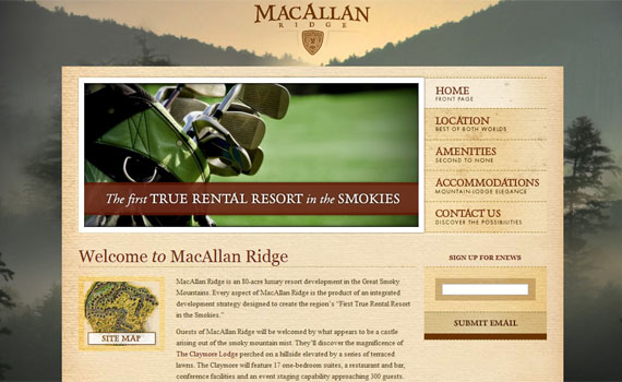
Choosing a good background. You can use an image, or a graphic for your background or you can also leave it plain and simple. See the websites below as an example.

Putting an appropriate color. Choose a color that represents what you advertise. Just make sure the shade of the color you choose looks professional and pleasing to the eye.
I’ve searched for the meanings of each colors and found these on the internet:
Red: action, confidence, courage, vitality

Pink: love, beauty

Brown: earth, order, convention

Orange: vitality with endurance

Gold: Wealth, prosperity, wisdom

Yellow: wisdom, joy, happiness, intellectual energy

Green: life, nature, fertility, well-being

Blue: youth, spirituality, truth, peace

Purple: Royalty, magic, mystery

Indigo: intuition, meditation, deep contemplation

White: Purity, Cleanliness

Black: Death, earth, stability

Gray: Sorrow, security, maturity

Source: Crystal-Cure
You can use the color that represents you or what you promote on your site, so viewers would know what to expect on the site.
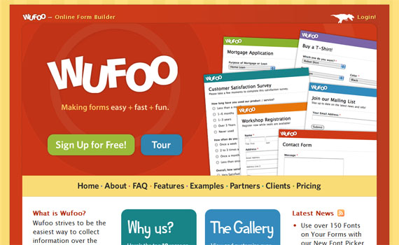
Using call-to-action buttons. Usually, call-to-action buttons are seen on the home page. Call-to-action buttons are a great way to force your viewers to click that button. Take a look at the image below, Wufoo has a great call-to-action buttons by making them noticeable and forceful.
Adding appropriate images and graphics. Images can give your viewers an idea or information regarding your content. You can place images for them to better understand what you wish to convey. Graphics can also represent your content and attracts the eyes of your viewers especially when they are colorful.
Designing your navigations as easy to understand. Navigations are viewers’ way to search on your website. Make sure from the home page up to the last site page your navigation is similar, very easy to use and
Writing a relevant information. Information is very important for viewers, even if this is the last thing they notice. Put a relevant information about what you would like your viewers want to know regarding your site. Make your content as brief and precise as possible for viewers hate to read very long paragraphs.
When creating a content, make sure the following are met:
- Your headline is very catchy.
- Use words that are pleasing to the ears.
- Be creative in choosing words, and make sure people understand the terms you use.
- Your words are spelled correctly.
- The content is grammatically correct.
- Your content is relevant to what you want to express.
Focus on your subject.
These questions can help you to decide on what to put on your home page:
- What is your purpose?
- Who you are?
- What are your goals?
- What do you want to convey?
Just focus on what you intend to show and convey on your home page.
Wrapping Up
There you go. Creating a catchy home page is not that difficult. You just need to:
- Know the basic of designing.
- Be appropriate.
- Be creative to be attractive yet remains to look professional.
- Focus on what your website is.
- Do not spoil them through your home page. Tease.
I hope this article can help you a lot in creating your home page to attract your viewers. Feel free to put some comments below :)
- Login om te reageren