Finding Alternative Sources Of Typographic Layout In Our Surroundings

 |
Studying art and design usually starts with a deep exploration of elements and principles. Among these elements, the most basic ones — line, point and plane — usually figure in a work of art or design. Thus, we can abstract art and design compositions to lines, points and planes when analyzing them. Not only is this abstraction useful for understanding the structure of a composition, but it also offers new sources of layout inspiration and experimentation.
The Framework Of Sources For Typographic Layout
According to Wucius Wong in his book Principles of Form and Design (page 42), point, line and plane can be considered conceptual design elements because, although they are not always explicit or visible, they seem to be present by implication. He explains how an angle, for example, implies the existence of a point and how lines, by marking the contour of an object, imply the presence of a plane.
In most art and design classes, students are asked to analyze the structure of a painting or design in order to better understand principles of organization. These linear studies usually have no relevance to the student outside of the class. But these exercises hold an important lesson, which is about learning to abstract images — and even our surroundings — into linear structures in order to learn about layout organization.
[Offtopic: by the way, did you already get your copy of the Smashing Book?]
Learning To Abstract What We See
Most of us live in a relatively static environment, whether urban or rural. Recognizing that this environment is framed by points, lines and planes will help us abstract the environment. Let’s consider a photo of an urban environment. Below is a photo of a city escape in Chicago:

(Photo courtesy of the Urban Studies Department, Wheaton College, Wheaton, Illinois.)
Here we have a worm’s-eye view of buildings. We can already discern interesting spatial relationships. The white space in and of it self has interesting shapes. These shapes alone give us creative ways to apply copy. Let’s see an example of how this space could be abstracted:

Linear abstraction.
Here, the city escape photo has been abstracted to simple lines. The lines converge at a conceptual point. The lines enclose spaces to create a conceptual plane. Although I did not mark the plane as such, lines that converge at any four points or angles become a plane. Abstracting spaces can, of course, be done in infinite variation. There is no right or wrong. Feel free to experiment!
In looking at the linear abstraction above, we see several lines converge at a certain point, which is towards the right and a bit off center. We can call this a point of hierarchy. Let’s clean up the abstraction and take another look.

Linear abstraction #2.
Now we have a cleaner and clearer version of the first abstraction, perhaps making it a bit easier to start thinking about a possible typographic layout. So, let’s experiment with type placement.

Typographic layout using the linear abstraction as a grid.
As you can imagine, we could do hundreds of variations of this. We can also play with the intersection of some of the lines and points in the layout:

Typographic layout using the linear abstraction as a grid and as visual punctuation.
These simple exercises in layout composition help us see how a photo of an urban landscape holds unexpected inspiration. Now, how do we use this for other applications? What if an article that we need to design does not have interesting or arresting photographs? One way to solve this is to think about the subject matter and find your own sources for inspiration.
Finding Inspiration In Your Surroundings
This is simpler than it sounds. It requires only that you be curious and get your dusty old camera out of the closet. You can find interesting shapes and arrangements in your kitchen drawer. Look out a window and study how its frame interacts with the space, or walk outside to look at the trees and branches. If you’re in the country, invite inspiration from the expansive landscape. Take photos of or sketch the most obvious linear connections you can find. If you’re in the city or suburbs, find the most obvious linear connections there. I find that buildings are an incredible source of inspiration with their strong vertical and horizontal lines.
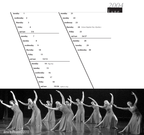
Other sources of inspiration are people moving, dancing and exercising. Here is an example of how a photo of a dance performance inspired my design of a calendar for the Iowa State Dance Department. I used the dancers’ strong movement to the left as the basis for the calendar’s grid:

Dance calendar for Iowa State University Dance Program, Ames, IA, 2004
(Copyright: Alma Hoffmann)
What About Web Design?
Browser capabilities for manipulating website layouts are still a bit limited, but not for long. On some websites — The Art of the Web, for example — you can find information and sources for experimenting by rotating elements. The Art of the Web recommends downloading the Webkit nightly build for your browser. It explains that, “Webkit is the rendering engine used by Safari. The Webkit nightly build browser, then, is a preview of what’s to come in Safari and other browsers and devices that use the same engine.”
Few websites use text rotation because of spotty browser support. If you know of any, please share them below in the comments. So then, how can we push layouts a bit more on the Web? What kind of sources can we use for inspiration? Two come to mind: architecture and landscapes.
Architecture gives us horizontal and vertical structures and spatial divisions from which we can take cues. We can play around with it in our horizontal and vertical grids on the Web. Services such as 960 Grid System let us download grids and experiment with spacing for Web designs.
Translating landscapes to the Web by using horizontal scrolling accomplishes two things: it puts the user in control of the navigation, and it evokes an expansive panorama. Peter Pearson’s website (screenshot below) takes full advantage of horizontal scrolling. It gives us a sense of landscape through photography and in the navigation itself. A humorous touch can be found in the invitation to the user to “Let’s go that way,” followed by “Gasp” in parentheses below:

Screenshot of Peter Pearson’s website.

A detail of Peter Pearson’s website.
Other websites push the use of landscape by letting users choose the direction to take. Some allow us to zoom out to see where we want to go, much as we do in a natural landscape. See this example of Schematic:

We stand before this website’s navigation much as we stand at a crossroad, choosing our direction. Allowing users to control their path engages them.
Other websites take advantage of the x-index to create a sense of depth and combine it with horizontal scrolling. In this way, the metaphor of landscape is even stronger and perhaps makes more sense, because the natural environment does have depth. The website for Fauborg (below) does both, while also providing a drop-down menu and hand icon for the horizontal scrolling:

Crowley, a small ad agency in New York, does not use horizontal scrolling, but rather selectively magnifies the menu and text to create perspective and depth. The arrangement has a sense of playfulness, and the user is engaged by seeking the little treasures stowed away in the links:


Exploring Web Design With Webkit
The ability to rotate text opens yet more possibilities for layout design on the Web. Browser support is still inconsistent but catching up to newer coding capabilities, such as HTML5, which allows for three-dimensional effects, and Webkit. With Webkit, I attempted to reproduce the layout discussed at the beginning of this article. Here is the original:
Below are screenshots of my experimentation with code and Webkit to reproduce the text rotation. Close, but not quite the same. The angles require just the right coding combination, because one block will inherit the values of the one above it.

Text rotation using Webkit. (Alma Hoffmann © 2010.)
Here is another example in which the title is rotated in the opposite direction of the title in the original layout:

Text rotation #2 using Webkit. (Alma Hoffmann © 2010.)
Conclusion
Abstracting the structures, spaces and people around us into simple line structures gives us infinite layout possibilities that can be applied to print and Web design. As technology keeps advancing and browser support continues to grow, Web design layout will continue to be more experimental and less restricted to horizontal and vertical alignments. As in the print industry, Web technology will continue to grow to accommodate more and more experimental layouts. These possibilities will offer designers more freedom and versatility. However, design essentials — such as learning to analyze composition and to abstract spaces — remain vital to our ability to translate the three-dimensional world in two dimensions, and vice versa.
References
- Jonathan Snook, author and Web designer and developer
- The Art of the Web
- Greg Dizzia, creative director of Daricca Group
- Stage Six Project In Progress Project
- Jeff Waymire, senior software engineer at SoftVu LLC
- Wucius Wong, Principles of Form and Design, Wiley, 1993
(al)
© Alma Hoffmann for Smashing Magazine, 2010. | Permalink | Post a comment | Add to del.icio.us | Digg this | Stumble on StumbleUpon! | Tweet it! | Submit to Reddit | Forum Smashing Magazine
Post tags:
- Login om te reageren