How to Not Suck at Typography Like a Designer-convert Doctor

We probably would all be savages if printing was not invented. The invention of the Gutenberg movable type has been a very great leap towards the spreading of information from one person to another and from generation to generation. After this momentous invention, greater finds have flourished and soon became what we know now as the software. Of course, without the invention of the movable type, printing would not be invented and all falls into oblivion, including one of the most reliable inventions man has ever made – the Internet.
Whether we admit it or not, the invention of printing is the unofficial father of all technology. Without it, technology would just be limited to mechanical modernization. Software would have probably not existed and the world would be a much gloomier place. Truly, the gallant invention of the Gutenberg movable type saved humanity from the decadence of ignorance.


Photos from kevinmallard.wordpress.com
This is why web designers value the importance of text. Though the print media is considered to be dying, web designers and developers have not put into obscurity the importance of text in spreading information. No matter how forgotten it may seem, words are still the primary means of spreading information. Words still have the power to influence, inform and entertain, which is why the great geeks of the Internet try to maximize the power of texts. They have been attempting to fuse texts with the growing and younger mediums for it to fully utilize its abilities. Hence, typography.
Photo from typographyfall2010.blogspot.com
Smashing Magazine describes typography as the soul of design. It includes the proper selection, juxtaposition and styling of typefaces to produce better effects so it serves its purpose better. It can breathe life to the barren text. With the booming of the digital era, typography has evolved all the same. Today, the art of beautifying letters include a wide array of topics and real life applications. Typography artists now focus on the communicative aspect of typography, making it more readable, identifiable, sellable and, of course, entertaining. We see typography almost every day in our lives- in the book you’re reading, in the newspaper your seatmate is browsing, in your daily advertisements, in the Internet, in the signs at the street, everywhere. Truly, the importance of typography has gone wider and wider as it evolves in terms of design schemes.

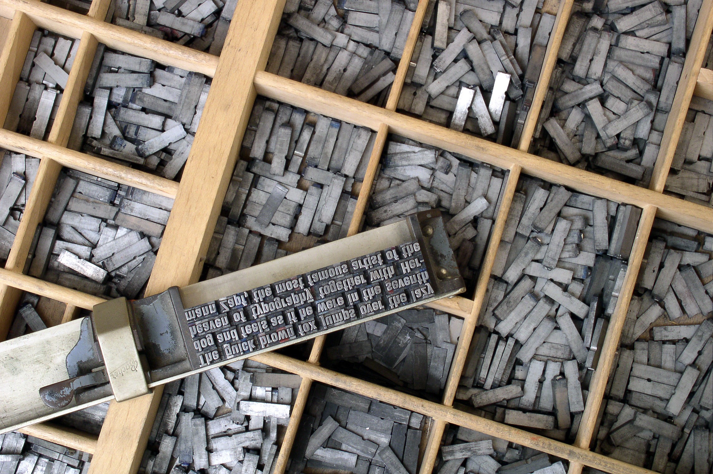
Photo from arena.liva.com.vn
It may be seemingly easy to study typography. Some may say that , ‘It’s just letters; how could difficult that be?’ but as easy as it seems, typography is an art that is very difficult to master. Most designers have hart times perfecting their skills in typography. Some even spend a great deal of money for it and never get better. Yeah, it goes a little frustrating at times, but studying this art form and mastering it is one great opportunity to earn and be known.
Be that as it may, you can never learn typography if you don’t start learning it. And when is the better time to do it than now!

Photo from zonters.com
In my previous post, I gave an overview of the things one should remember when making typographies. It’s fairly enough for someone who knows what to do to know what not to do. But in this case, because typography is a very complex field, the need to discuss the don’ts are very grave.
So what are the don’ts in typography?
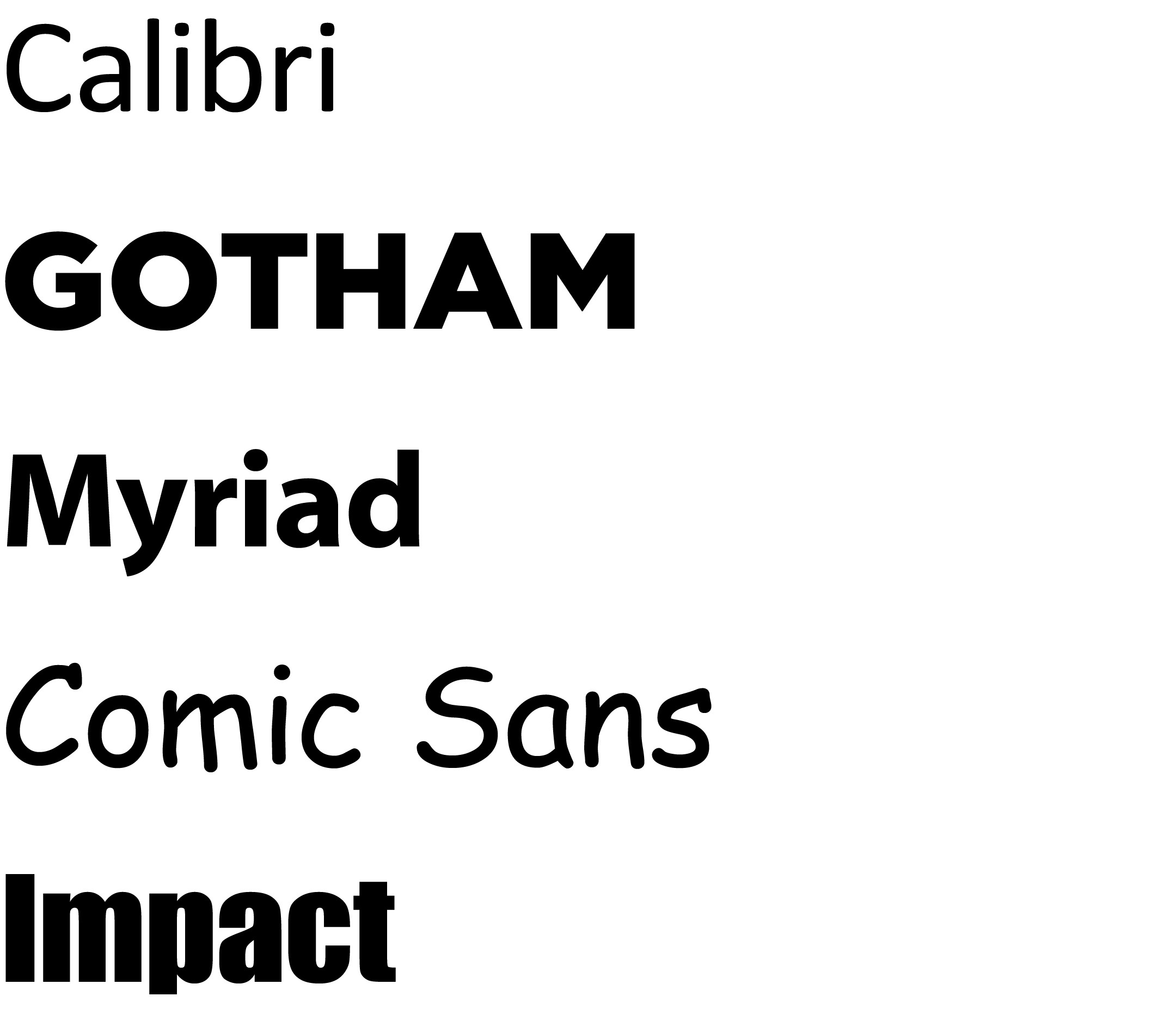
Do not use too many typefaces in one page
I’m sure almost everyone has a hundred+ fonts saved in their hard drives; and I bet half of us want to use them right? But let me cut your enthusiasm with this reminder, use minimal typefaces in a page. Having a lot of worthless, different typefaces in a page will suggest an inconsistency in your design style and could give the readers a hard time reading. Just put it this way, you buy all kinds of food in the supermarket, would you eat the all at once in a single munch?

Photo from johnjacob.ca/type
Links that would help
- Choosing the Right Font: A Practical Guide to Typography on the Web
- “What Font Should I Use?”: Five Principles for Choosing and Using Typefaces
- How to Choose the Right Fonts for your Project
- What the Font? Choosing The Right Font For Your Project
- How to Select the Right Fonts for your Website
- A Beginner’s Guide to Combining Multiple Fonts
- How to Choose the Perfect Font for Your Needs
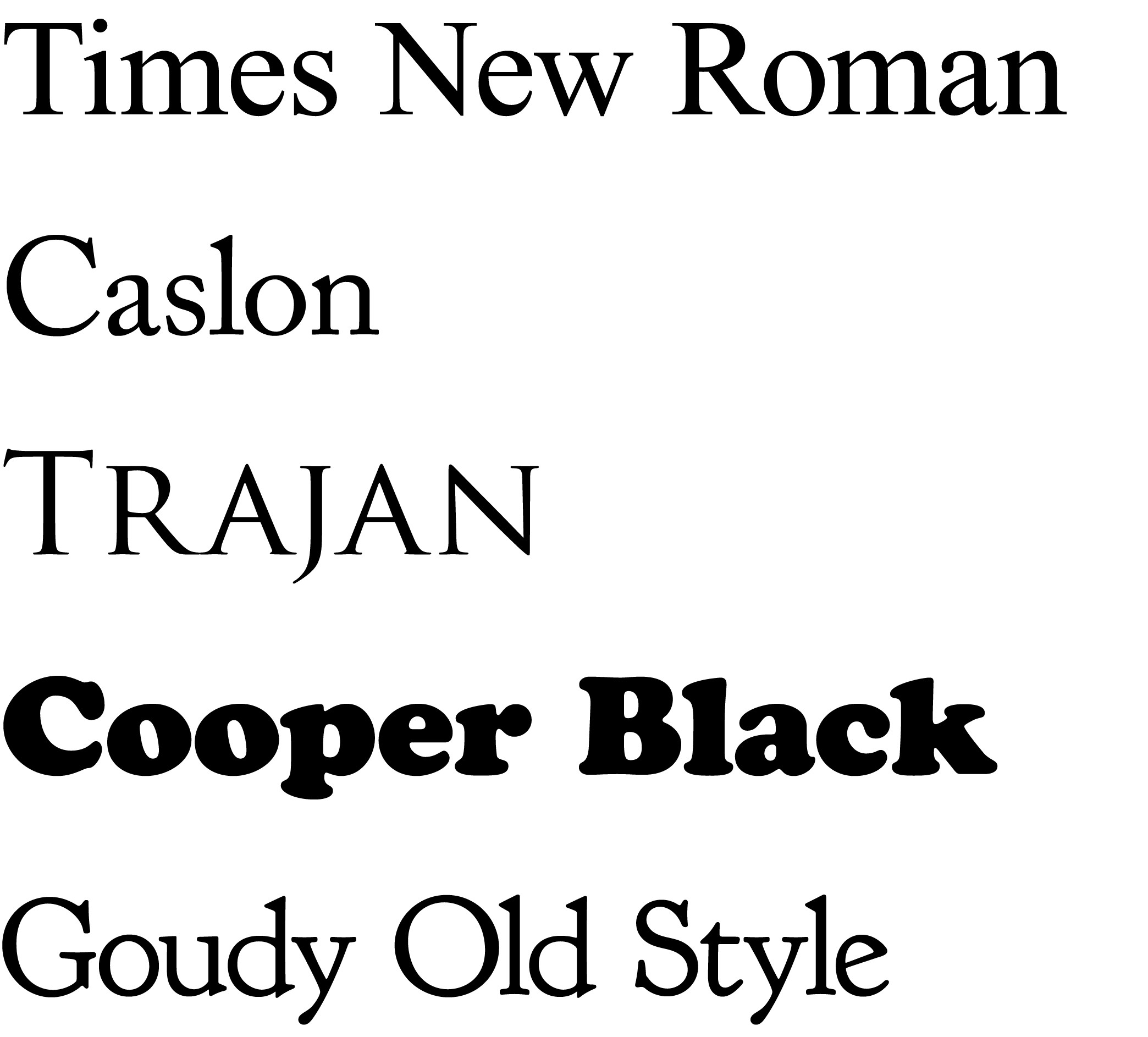
Do not use serif and sans serif fonts interchangeably
Most people tend to interchangeably use Serif and Sans-Serif Fonts. The truth is, doing this might affect the readability of the page. Sans Serif Fonts are usually used for pages that should be seen from afar. These are very readable even from a great distance. Meanwhile, Serif Fonts are used for private-reading activities. That is why most books use serif fonts.
Links that could help:
- Working with Types: Typography Design Tutorial for Beginners
- Serif vs. Sans: The Final Battle
- Serif and Sans Serif Fonts
- Which Are More Legible: Serif or Sans Serif Typefaces?
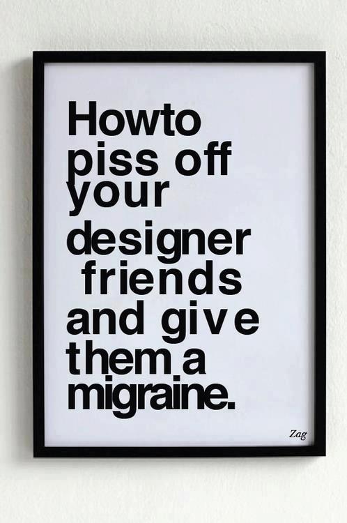
Do not use all caps all the time
WHAT DO YOU FEEL WHEN YOU READ THIS PARTICULAR SENTENCE?
Didn’t you feel congested and annoyed? Caps are used to emphasize important messages in the body of the text. But to type a 100-word typography in all caps, it’s too much. People might think you’re angry or shouting. Remember, not all messages are important. Know the difference.

Photo from thedeviljumpedonmyhead.com
Do not use Comic Sans, Papyrus or Curls MTz as much as possible
Okay. You’re probably wondering why. Let us think of this as in this situation. You’re listening to a song, the song was very good. The lyrics were awesome and the melody is superb. Because you felt the song was really good, you listened to it all week, non-stop. The next week, you hate the song.
This is what happened to these fonts. They became too mainstream. They were repeatedly used and clichéd to a point where everybody is sick and tired of them. Try something new. There are a lot of fonts out there. You won’t be even able to choose from them all.

Photo from modernsoutherner.com
Do not auto-Kern
Kerning is the measure of the spaces between characters. Kerning adjusts individual letters in a typeface and creates a visual appeal in the text. Photoshop, a tool we love to use in making typographies, is a great program. It has an auto-kerning function but it’s never as accurate as those squiggly balls in your eye sockets. They are way better because sometimes metrical kerning is faulty and produces a mathematically correct but visually distorted type.
Links that could help
Don’t use texts below 10 for the body
Not everyone can literally read between lines. Keep your texts above 10 for them to be easily read. If you’re having trouble because of the large amount of content to be placed in such small space, contemplate if you reduce the text or apply spacing adjustments. Never reduce the font size to 10 below, except if you want the message to be ignored. You’re not making a typography for ants.

Photo from docstoc.com
Links that could help:
- Typographic Design Patterns and Best Practices
- Secret Symphony: The Ultimate Guide to Readable Web Typography
Conclusion
A bad typography is as bad as a stale bread. It’s there but you can’t eat it. It’s there but you can’t digest it. The best thing to remember about doing typographies is that the message is superior to everything. The reader must understand the message before anything else.
- Login om te reageren